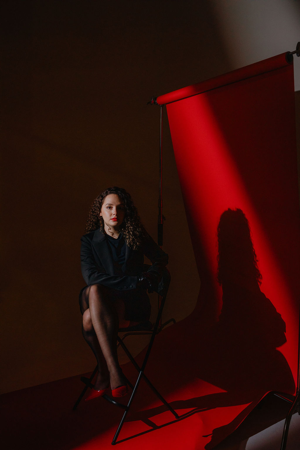
In this episode, you’re getting a full rundown on Highflier Powerhouse’s latest rebrand. From choosing a bold new color to honing our signature editorial style, we’re taking you behind the scenes through the whole process.
Highflier Powerhouse walks the walk with intentionality leading every branding decision. So here’s to branding our way to a million, together!
A Creative's Guide
A blog written by creative director Jasmine Haitalani where she shares how she approaches each part of brand building in her business and for industry leading clients. Indulge in each post and get inspired to take action that allow you to set the standard, improve your brand and make revenue.
TRENDING TRENDING TRENDING
featured
Welcome to Brand Your Way To A Million! Here’s Our Full Rebrand Recap
June 6, 2024
Welcome to Brand Your Way To A Million! If you’ve been a fan of Becoming The Brand for a while, don’t fret. Your favorite podcast still exists. It’s just undergone a rebrand! So today, the podcast is actually a perfect example to take you behind the scenes into the rebranding process. We’ll start with why I felt like now was the time for a rebrand, what elements we intentionally changed, and close out with what the plan is.
Believe it or not, I actually didn’t plan on changing the direction of the podcast until the final days of the rebrand. If you’re on the email list, you’ve been getting updates and sneak peaks along the way, but today, we’re really getting into the intentionality behind every choice. From choosing to go with a rebrand instead of a refresh to the details of the photoshoot, we’re covering it all!
How Often Do I Need to Rebrand?
It’s important to be discerning about rebrands. If you’re doing it too often, it can lead to distrust and a lack of brand awareness. But if you’re not going through the process often enough, it can lead to buyer fatigue and fall out of alignment as your vision and values evolve. So the first thing I want to cover is the question “why now?”
For me, this felt like a pivotal moment because the agency was growing out of the previous rebrand. This is how you know you’re ready for a full rebrand versus a brand refresh! There is a difference between feeling a bit tired of using old photos and feeling like the brand is no longer a vehicle that can take you where you need to go.
How Current Branding Trends Affect Your Brand
Don’t get me wrong, the rebrand that we underwent in the Summer of 2021 served us really well. Every choice we made was a dramatic departure from the trends at the time. We were differentiating ourselves by leaning into the all black look! In the Summer of 2021, the industry was over saturated with minimalist, boho, beige and neutral colors. No shade to anyone with this aesthetic, but it wasn’t aligned for Highflier Powerhouse’s brand.
I even tried to fit this mold in the beginning! One of my very first photo shoots was done in a field of flowers and it just didn’t feel like it represented me at all. And that was really the catalyst that made me realize I needed to find a brand that felt right for me.
Our First Rebrand
I began with a commitment to a simple black palette. Then, I brought in elements of spirituality into the imagery that later got stripped back as we elevated the visuals. The fonts got cleaner and more strategic, valuing legibility over fancy flourishes.
And once this rebrand was solidified, I stuck with it for years. Of course, small refreshes were incorporated every single year. As I’ve mentioned in previous episodes, yearly photoshoots helped to ensure that the visuals weren’t going stale. The sun, moon and star graphics were slowly phased out. But across the board, the brand has stayed widely the same for a long enough period that we’ve gained solid brand recognition with our audience.
The Reason Behind This Rebrand
It’s important to me for the brand to reflect a more mature version of not just myself, but the agency and what we plan on doing. We earned seven figures of lifetime revenue with the previous iteration of our rebrand. At the same time, I grew the business so much; I grew the team; I grew my skill set as a leader.
With my first rebrand, the decision to lean into the all black look was super intentional, and it served its purpose for years. But now, keeping the current landscape in mind, the all black look isn’t setting us apart in the way it once did. Consumers and business owners have moved away from the beige, boho-chic and more people have embraced the all black, clean visuals.
Keep in mind that we really want cold leads to immediately associate our brand with innovation. We want our brand to help us stand out in every way that it can. If our visuals look like everyone else’s, it’s really hard for a stranger on the internet to differentiate your business from the rest. So now the question of “how can we stay true to ourselves and make sure that we’re standing out from the crowd?”
I’ve never wanted our agency to have a specific design style that we deliver for every single client. Instead, clients come in and we translate their personality and their vision so clearly that it’s impossible for their cold leads to forget them. So I took the same approach that I take with my clients for my brand! And I started asking myself questions like “what have the strengths of the brand been?” and “what changes do we need to make to continue evolving?”
I know our peak performance is lying in a rebrand and that’s exactly why I moved forward with it. You don’t have to feel like your brand isn’t working at all in order to go through the rebrand process. But be prepared because it requires you to step out of your comfort zone!
Behind The Scenes Into Our Rebrand Process
We always want to make sure that we’re honing in on what has been working. We don’t want to scrap everything and start from zero. Because mostly when you’re rebranding, you’ve already achieved some success in your business! Instead, it’s important to use the data you have from your current brand. What are people responding well to? What clients is your current brand attracting? Are they in line with certain aspects of your ideal clients and not others?
The goal of the rebrand is to take your strengths and enhance them across the board. For example, maybe right now, your visuals on Instagram are on fire, but the website looks like it was built by an amateur years ago. Taking these weaknesses into account is the cornerstone of positive change with your online presence.
You have to be ready to be brutally honest with yourself. Admitting the weaknesses of your brand can feel like an ego hit, for sure. Taking our rebrand as an example, I knew I could be better at attracting and converting cold leads. And because of my experience in this industry, I knew this was directly related to our visuals. The all black look wasn’t standing out in the same way it used to. I needed to showcase why we are different and visually represent us in a new light. Not to mention, we’re a seven-figure agency! Some changes needed to be made to elevate the visuals to reflect that.
Specific Changes We Made to Elevate Highflier Powerhouse’s Brand
I’ve never been big on logos. I don’t think that they’re always the most important thing for service-based entrepreneurs. Of course, we create logos for our clients. But if you go through the previous iterations of our brand, you probably don’t know what Highflier Powerhouse’s logo looks like. And that’s intentional!
We want our brand to be the energy that we give off and the first impression that you get when you interact with us, our brand versus a logo. So here’s what we’ve been working behind the scenes on building out for our rebrand:
Leading with Red
After years of being entirely neutral and really leaning into black as the main color in our color scheme, we’re leading with red! Leading with black in the past really helped our words, client work and imagery stand out. So bringing red into the mix needed to be a really intentional decision. As I’m sure you know, each color has a specific feeling and connotation associated with them. Red feels like the perfect addition because of how bold and powerful it is.
Editorial Design
We’ve made the website design a super editorial. The imagery should be a core focus, not overcrowded by anything unnecessary. I wanted the work to shine through above all else. From the actual layout and typography to the titles of the pages, everything is intentional. The “Portfolio” page is now titled “Client Catalog” and this just drives home the world that we’re creating. Now, instead of scrolling through a regular website, it feels like diving into a sleek magazine.
Imagery
The photography was very important to me. Believe it or not, this was the first shoot where I had my natural hair color and pattern. Embracing my natural look felt incredibly empowering to me. But I also intentionally planned the photoshoot so that it had a healthy mix of what I call creative shots versus signature style, evergreen shots.
Creative shots are a bit more experimental, fun and “out there.” But they don’t always go the distance that signature style shots will. Your signature shots are going to be the more traditional, straight forward shots. In past photoshoots, I’ve swayed creatively. And I loved the shots! But this time, we focused a bit more on longevity and getting that perfect blend of both types to ensure longevity.
I used the exact framework that I use with Rebrand Experience clients to portray myself in the founder, CEO energy and get great shots in a two-week timeframe!
New and Improved Audience Touch Points
We’ve changed the direction of the podcast, the email series, and added this blog to enhance the user experience. These decisions reflect the maturity of the brand. Beyond imagery, we want to make sure that the way we’re showing up for all of you is elevated.
We’re no longer operating straight out of a phony feeling brand shoot in a field of flowers. This is a brand that has been built and sustained over years. I’ve moved from my early twenties to my late twenties in this time period.
When is the “Right” Time to Rebrand?
The business calendar is never 100 percent open. But when you partner with an agency that understands what you’re looking for, it doesn’t have to be a huge stressor in your life and business. And when you partner with an agency that has experience in setting up the right systems, it’s an incredibly fun process. So if you’re feeling the need to rebrand, ask yourself a few questions:
- What aspects of my brand do I feel I’ve outgrown?
- Have I given my audience time to find brand recognition in my current brand? If not, it may be too soon for a full rebrand.
- What strengths do I want to keep from my current brand?
Your rebrand is the assets, marketing and sales material, but it’s also the confidence, the energy, and the identity shift. There are so many entrepreneurs that we have worked with that come to us feeling like they are tiptoeing between the old iteration of them and the new. This makes their visuals fall out of sync with their messaging. And it makes it much harder to draw in aligned clients when they’re deciding based on an old type of client.
You have so much experience, you’ve built a reputation, you’ve made revenue, and yes, it’s working with the current iteration of your brand, but it doesn’t represent you in the best way. Especially for those of you that want to grow from that, not just maintain – it might be time for your rebrand.
THE LATEST
THE
MARKETING EDIT
Get edits you can make to your brand marketing to increase your revenue delivered straight to your inbox.
JOIN OUR EMAIL SERIES
Learn how to create an extra $100k with your Rebrand by becoming the only option, just like our clients.
Get access to our free training where you'll learn how to make an extra $100,000 in revenue after you rebrand your business as a coach or service provider.
GET THE TRAINING
COPYRIGHT HIGHFLIER POWERHOUSE 2026 | TERMS AND CONDITIONS | PRIVACY POLICY
COPYRIGHT HIGHFLIER POWERHOUSE 2026 TERMS AND CONDITIONS | PRIVACY POLICY
Navigation
Learn
Connect
Highflier Powerhouse is an immigrant-founded agency based in the United States that offers marketing and creative services to service-based entrepreneurs across the globe.
a creative's guide
BRAND YOUR WAY TO A MILLION
THE SALES STUDIO
THE INDUSTRY'S CHOICE
THE MARKETING EDIT
[THE PODCAST]
[THE blog]
[THE email list]
[DFY RETAINER]
[DFY PROJECT]
HOME
CLIENT CATALOG
ABOUT US
BROWSE //
WORK WITH US //
AND MORE //
HOME
CLIENT CATALOG
ABOUT US
BROWSE //
WORK WITH US //
AND MORE //
RESOURCES
OUR OFFERS
BECOME THE CELEBRITY OF YOUR NICHE
[PRIVATE PODCAST]
a creative's guide
BRAND YOUR WAY TO A MILLION
THE MARKETING EDIT
[THE PODCAST]
[THE blog]
[THE email list]
GO BACK
BECOME THE #1 BRAND IN YOUR NICHE
[the PRIVATE PODCAST]
Paragraph
Paragraph


